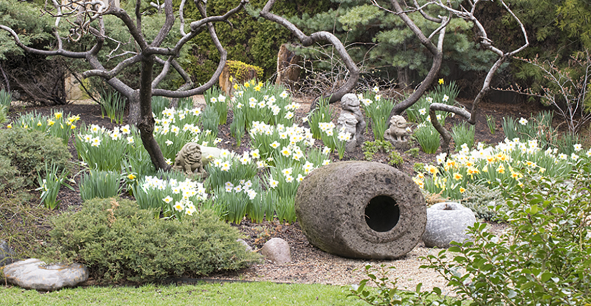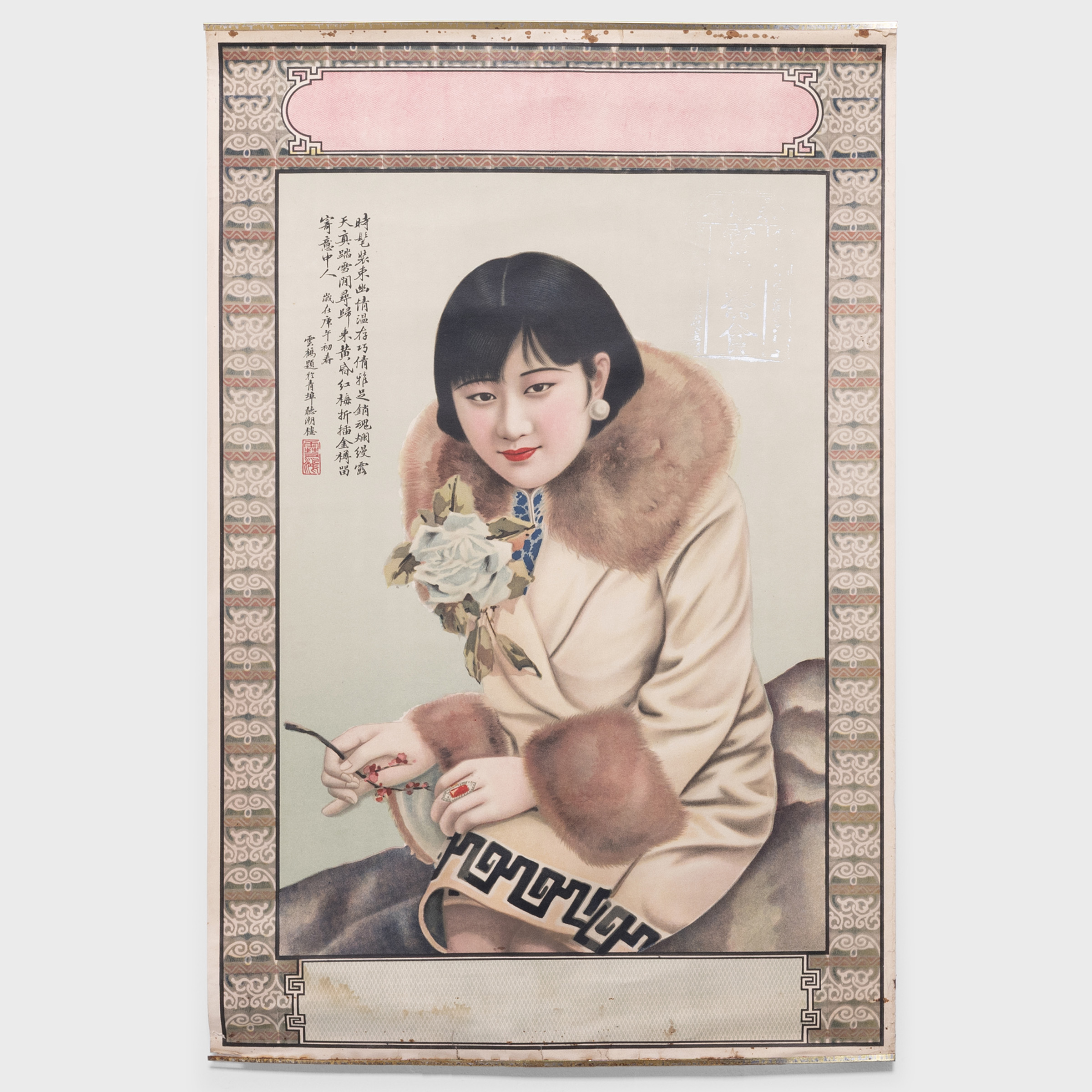
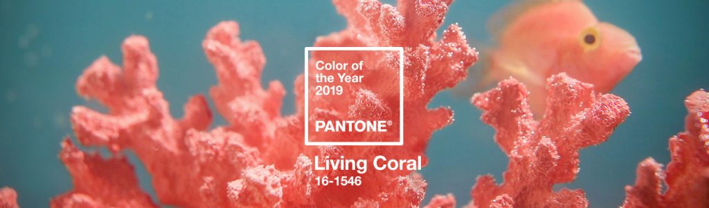
In Living Color: Pantone’s Pick for 2019
“Animated and life-affirming,” those are just two of the uplifting descriptors Pantone lavished upon their recently announced color of the year—Living Coral 16-1546. At the precise intersection of vibrant pink and sunny orange, we think that the hue feels both distinct and special. We agree with the forecaster when they claim the shade, “energizes and enlivens with a softer edge.”
From Pantone:
“Living Coral emits the desired, familiar, and energizing aspects of color found in nature. In its glorious, yet unfortunately more elusive, display beneath the sea, this vivifying and effervescent color mesmerizes the eye and mind. Lying at the center of our naturally vivid and chromatic ecosystem, Pantone Living Coral is evocative of how coral reefs provide shelter to a diverse kaleidoscope of color.”
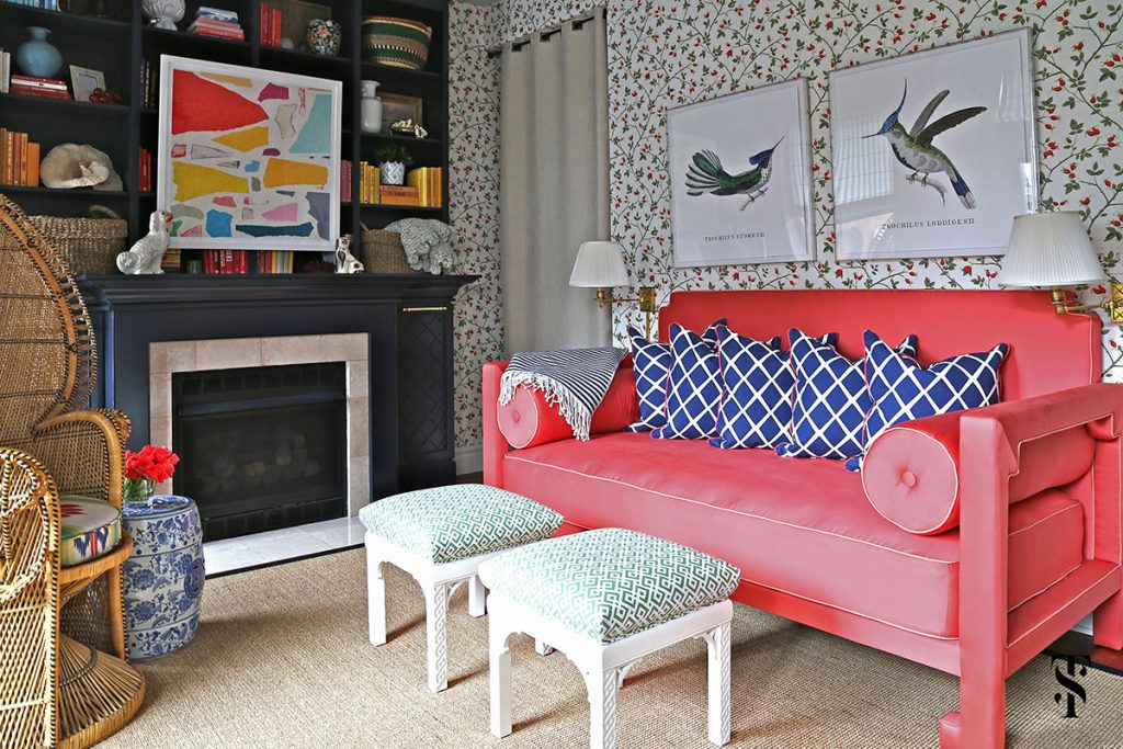
Living Room by Summer Thornton Design.
We love the idea of using the shade to deliver a burst of energy to a living space, whether it be through accessories, furnishings or artwork. In the room above, designed by Summer Thornton, the bold coral of the settee is grounded and balanced by blue and green textiles, and a neutral floor. The result is a room that feels both inviting and fun.
“Living Coral welcomes and encourages lighthearted activity,” says Pantone. “Symbolizing our innate need for optimism and joyful pursuits, Living Coral embodies our desire for playful expression.”
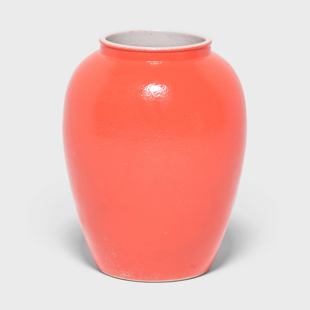
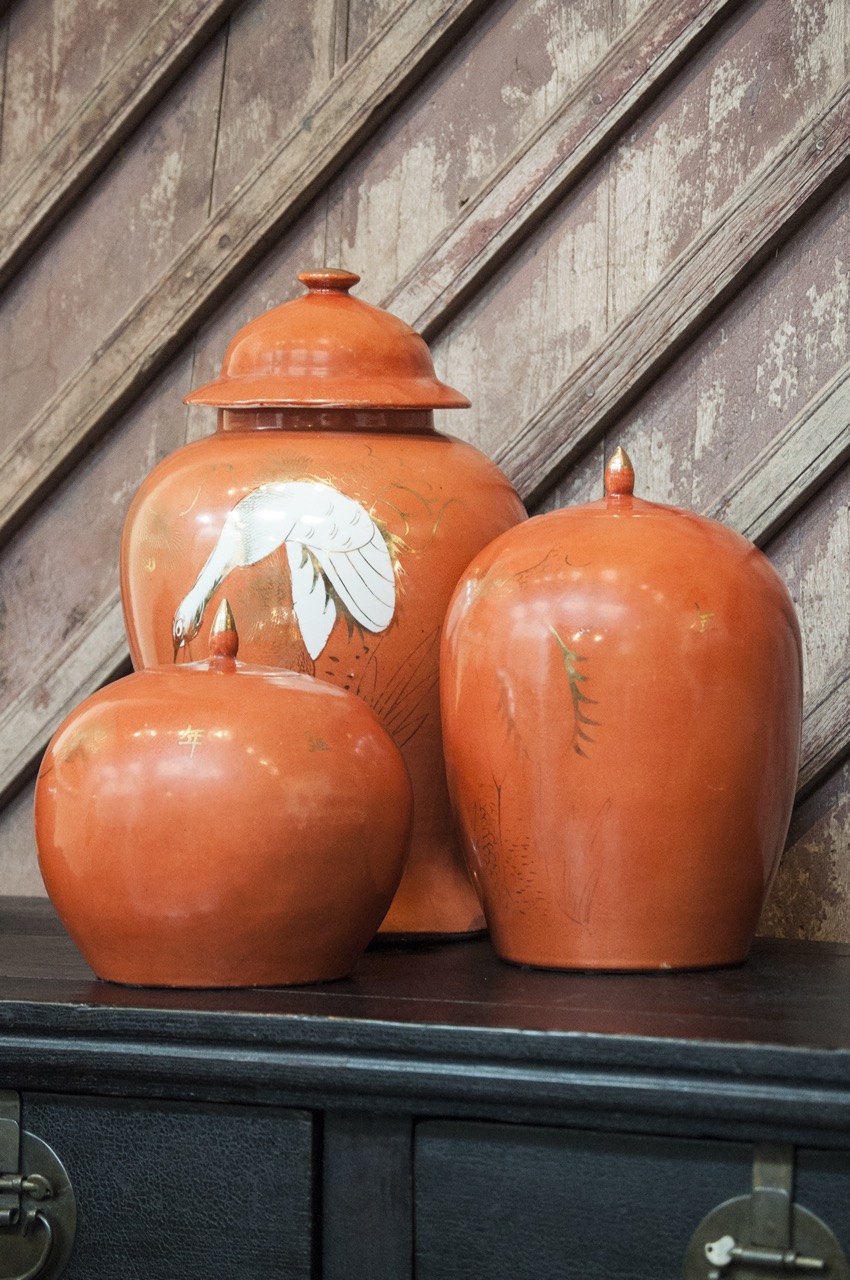
Persimmon Baluster Jar | Dia: 10.0″ H: 17.75″ | Porcelain
Adding a pop of pigment via a boldly-glazed ginger jar or vase is one of our favorite ways to bring interest to a bookshelf or hearth. Brilliantly toned to resemble a Chinese persimmon, the contemporary vessel above adheres to the time-honored form of the Chinese baluster jar. The persimmon is an auspicious symbol of joy in traditional Chinese art, which seems energetically synched with Pantone’s verbiage.
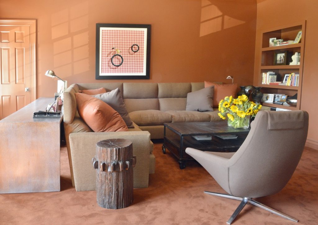
Sitting Room by Vicente Wolf. From “The Four Elements of Design: Interiors Inspired By Earth, Water, Air and Fire.”
If choosing coral as the dominant hue in a room seems a bit too audacious—consider layering it in soft, slightly-varied shades, for a gentler take on the trend. The room above, designed by Vicente Wolf is a wonderful example of how soothing and enveloping this monochromatic approach can feel.
According to Pantone, Living Coral “embraces us with warmth and nourishment to provide comfort and buoyancy in our continually shifting environment.”
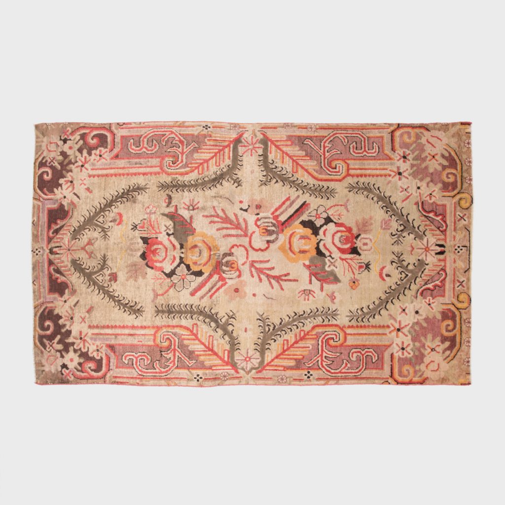
Samarghand Rug | c. 1850 | W: 110.5″ D: 62.0″
Another shortcut to excitement and movement is through the use of a show-stopping rug. This Central Asian carpet blends coral with other colors-of-the-moment like blush and plummy-grey, resulting an ultra-contemporary palate. Handmade from wool, circa 1850, the rug hails from the oasis towns of East Turkestan, and reflects a fascinating blend of the neighboring cultures that influenced its design.
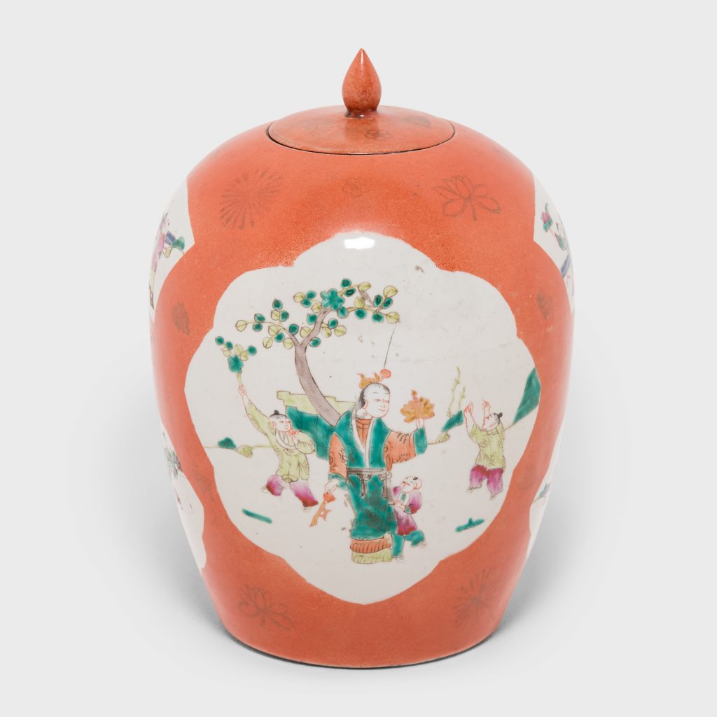
Persimmon Ovoid Ginger Jar with Cartouche Paintings | 1920 | Dia: 8.25″ H: 12.75″ | Porcelain
In another riff on persimmon-hued glaze, the 1920’s vase above would make a powerful statement in any space. Aside from its on-trend embellishments, the piece is a great example of enduring Chinese design. Attendants in a garden watch over young boys playing with lotus branches, butterflies, and small charms. The scenes symbolize wishes of prosperity and longevity—and high hopes for the future. How perfectly in keeping with the optimistic mood of the latest color of the year!
“The humanizing and heartening qualities displayed by the convivial Pantone Living Coral strike a responsive cord,” says Leitrice Eiseman, executive director of the Pantone Color Institute.

Want to See More?
Shop the Living Coral Collection
Located in the Bucktown neighborhood of Chicago, our dynamic 15,000 square-foot gallery is always changing. Storied furniture, fine art and extraordinary objects from around the world are waiting to be discovered. We invite you to experience the spirit of PAGODA RED online or in our gallery.