The recently remodeled North Shore home of PAGODA RED founder Betsy Nathan, and husband Daniel Goldberg, was featured in Luxe Magazine. The project was a collaboration between a dream-team of interior designers, architects, and landscape designers who worked together to create this storied, ultra-personal space. In this peek behind the scenes, Frederick H. Wilson of Morgante-Wilson Architects, Kathy Manzella of de Giulio Design, and Creative Director Carlos Martinez share expert solutions to problems they encountered along the way.
Fred and Carlos were tasked with incorporating a sizable art and furniture collection into their design. Though the project included a substantial addition, the shared goal was a seamless final product. “One of the main principles was to make it look like we were never there—so there was no glaring ‘this was done this year, and that was done that year,'” Fred explains.
“I love vintage architecture,” says Carlos. “Betsy’s home had a wonderful sense of authenticity—it was cozy and warm and felt North Shore in the way that it used to be. Betsy has so many amazing objects, such eclectic style, as we were talking—I told her that we needed to do a project that when it was done you couldn’t tell that it was done. It’s hard to not lose the essence of the house.”
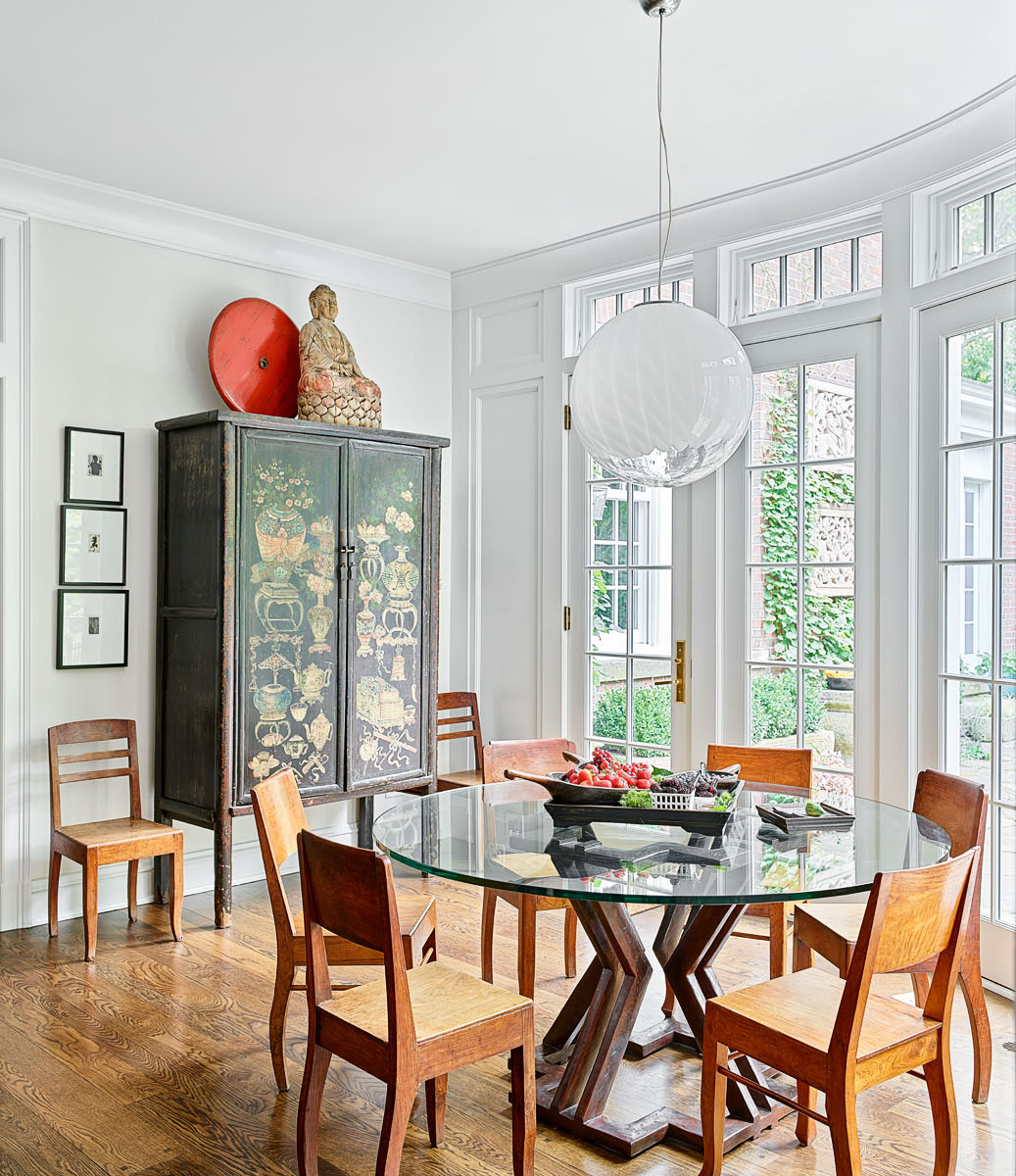
Photo: Michael Robinson.
According to Fred, the breakfast room was a great example of this principle at work. “We utilized a bend in the foundation to create a breakfast room in the little knuckle there. The house had a lot of architectural detail, which we wanted to continue, but we also wanted the architecture to recede so that it could be in the background of the collection. That created an interesting dialogue.”
The curved wall of glass created the perfect nook for a round table. “Those devices help reconcile everything to make sure there’s no wasted space,” Carlos explains.
“One of my favorite things to do with a project is—the front has a neighborhood presence, but the back can blow out and become something else,” says Fred. “The front of this house is static and symmetrical, and we kept the window placements within the Georgian order. Meanwhile, in the back, the walls kind of fall away and you’re in nature—the nature is a sculpture in itself.”

Photo: Michael Robinson.
“In the back, the house is less formal and becomes more organic—I used that to articulate the extension,” says Carlos. “It became very much about the experience. When you experience architecture, you don’t remember the plan—you remember the way you moved through the space.”
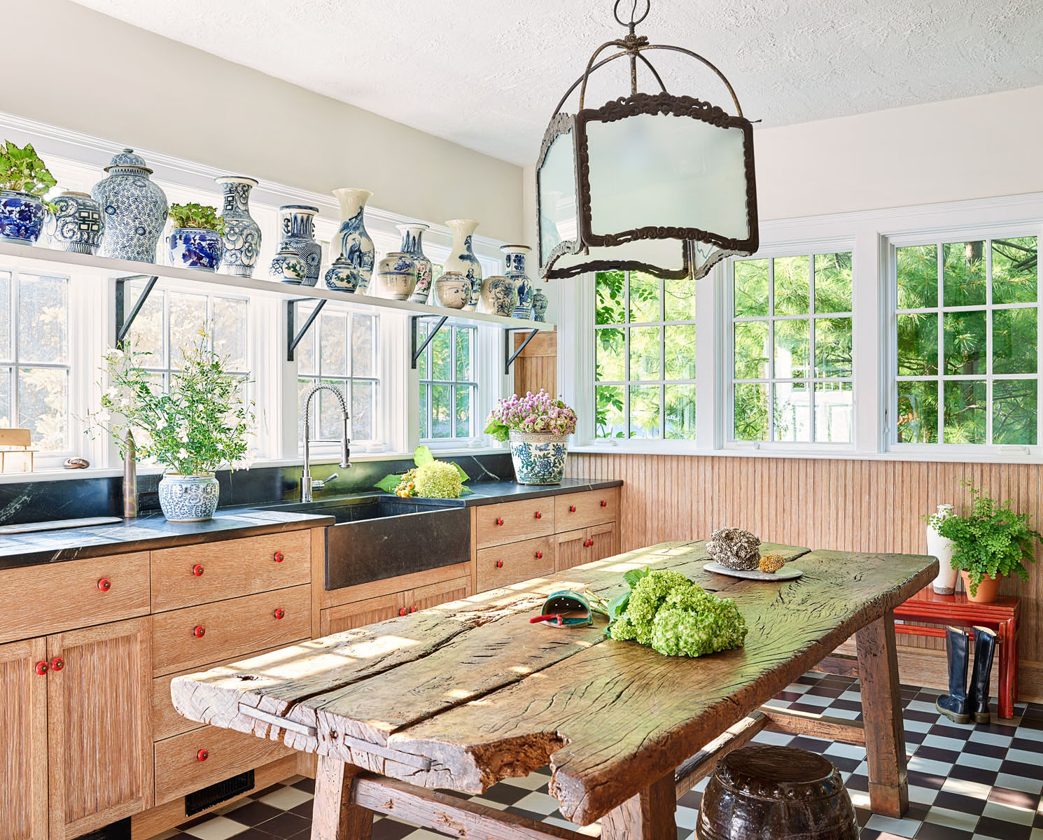
Photo: Michael Robinson.
Meanwhile, interior designer Kathy Manzella’s challenge was incorporating found objects and antiques into a functional kitchen.
“I wanted to keep things really clean and open so Betsy’s collection would be showcased,” explains Kathy. For the backsplash, she sourced hand-cut, iridescent Moroccan tiles, and designed ingenious sliding panels, concealing small appliances for a clutter-free counter. Floating shelves on either side of the sleek stainless hood were customized with Betsy’s antique Guan Zhong apothecary jars in mind. The choice to make the tile continuous, from counter to ceiling (including shelving) furthered the open, clean-lined feel.
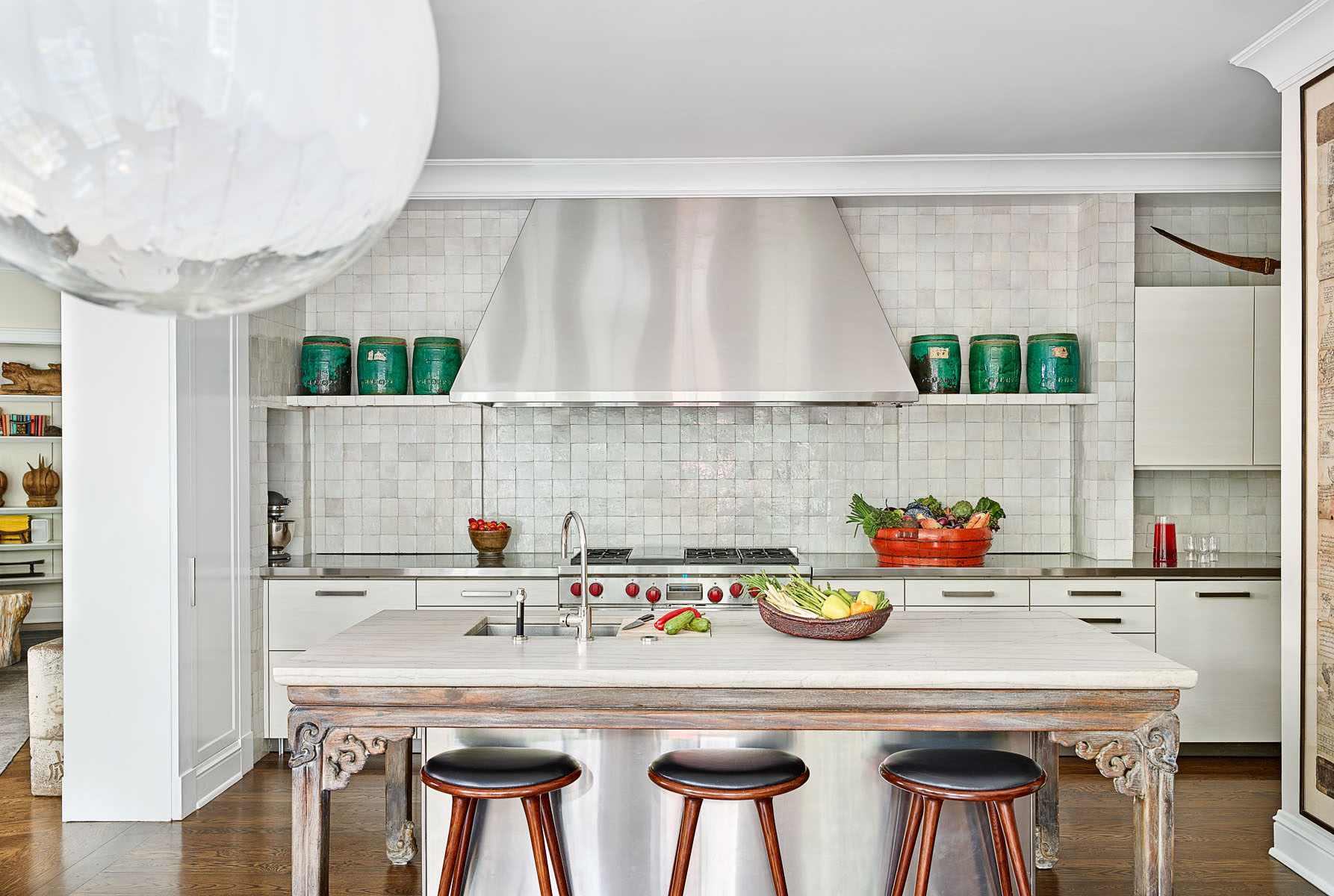
Photo: Michael Robinson.
Even the hardworking kitchen island became an opportunity to display a one-of-a-kind antique. “We searched through the PAGODA RED warehouse to find the perfect island piece–an amazing 19th century elm-wood Chinese calligraphy table, and combined it with stainless steel and White Macaubus quartzite,” explains Kathy.
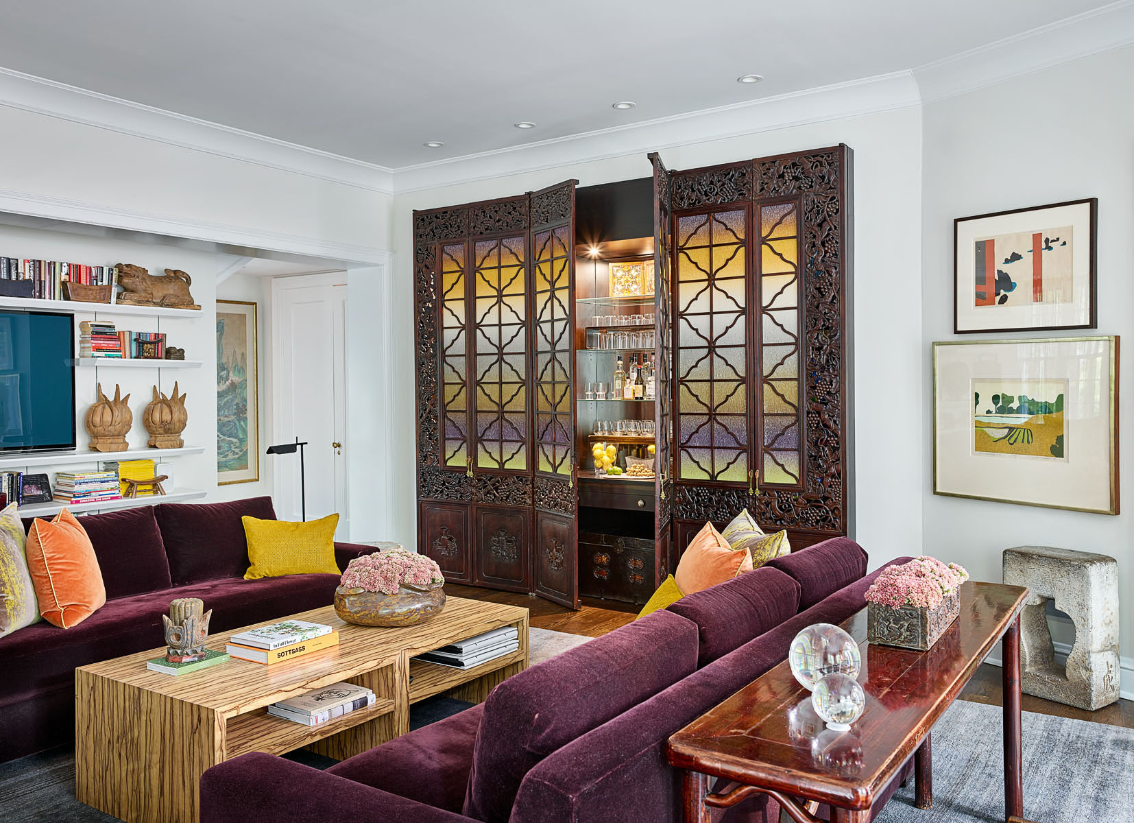
Photo: Michael Robinson.
According to Fred, this wasn’t a typical project where an art lover might eventually hang paintings on a wall or two. “We actually incorporated pieces from the gallery into the architecture, so they became functional and usable,” he explains. “For example, we knew we wanted a bar [above] against the wall—and that’s when Betsy stepped in. She’d say ‘well, I have these doors…’ She has this database in her head that she can draw from.” Backed in a vibrant Knoll Rodarte fabric, 19th century Chinese doors become a dramatic statement in the family room.
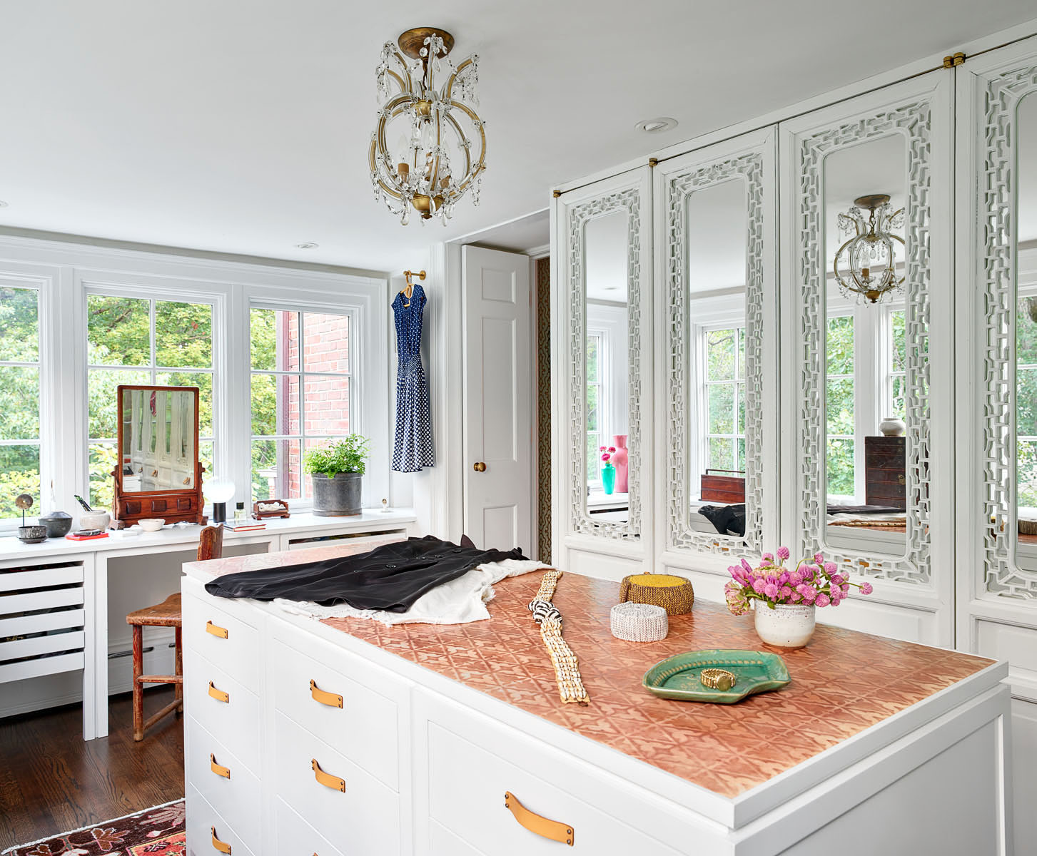
Photo: Michael Robinson.
“The different elements placed in the home are all beautiful, but they are all very different,” Fred reflects. In his view, incorporating antique and architectural materials during (rather than after) the design process is part of what makes the space work so holistically. “They are all soft in the space,” he explains, “they don’t club you over the head.”
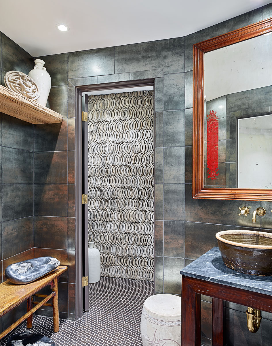
Photo: Michael Robinson.
“The antique roof tile wall in the basement powder room [above] is a good example of this,” says Fred. “The tiles became the ornament of the room—like a wallpaper.” The washstand is custom. It combines a Chinese ceramic bowl circa 1900, with a soapstone slab, while the reverse-glass mirror hanging above is 1920s Shanghai Deco.
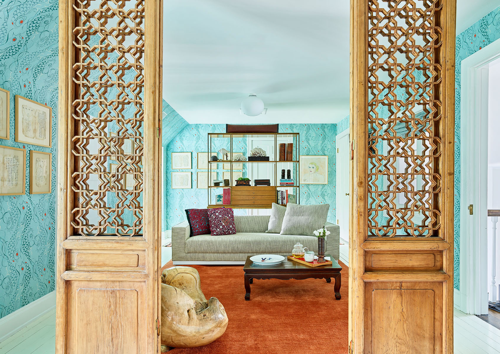
Photo: Michael Robinson.
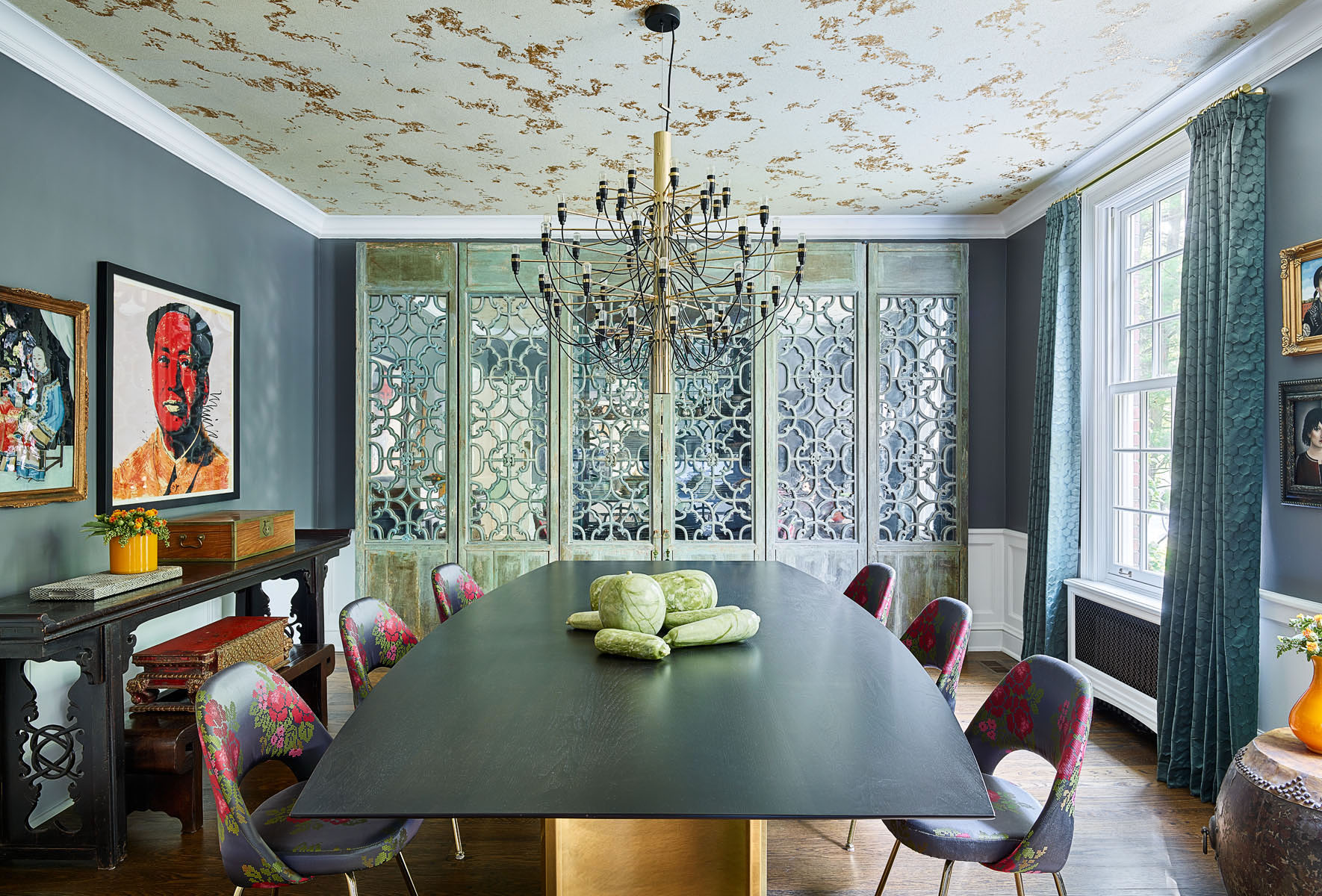
Another great example? Antique door panels. A handful of sets made their way into the project—each pulling double duty as functional and decorative elements. Hinged courtyard panels [above] help define and screen an intimate sitting area. A mirror-backed set elevates Betsy’s dressing room, and yet another adds glamour to the dining room [hero shot.]
“Betsy’s known for being an amazing expert and resource for Asian art,” says Carlos. “I wanted the house to have some of that but it needed to be about this place, this family and hold these parts of herself. We put paneled doors into the dining room and treated them as works of art. They appear to be floating, no frame—we treated these things as her sensibility, her point of view.”

Photo: Michael Robinson.
“In this house, it was about unhooking from a moment and thinking instead about the passage of time. It was Betsy’s journey through life that allowed her to bring these things together,” says Carlos. “Art is a great window into the psychology around what moves someone. Betsy doesn’t collect for investment or status; she collects because things mean something to her—that’s how she communicates.”
In the couple’s bedroom [above], an eclectic mix of old and new creates a warm, sumptuous space. African fabrics, Chinese antiques, and contemporary furnishings flow together, thanks to a symmetrical layout and rich color palette.
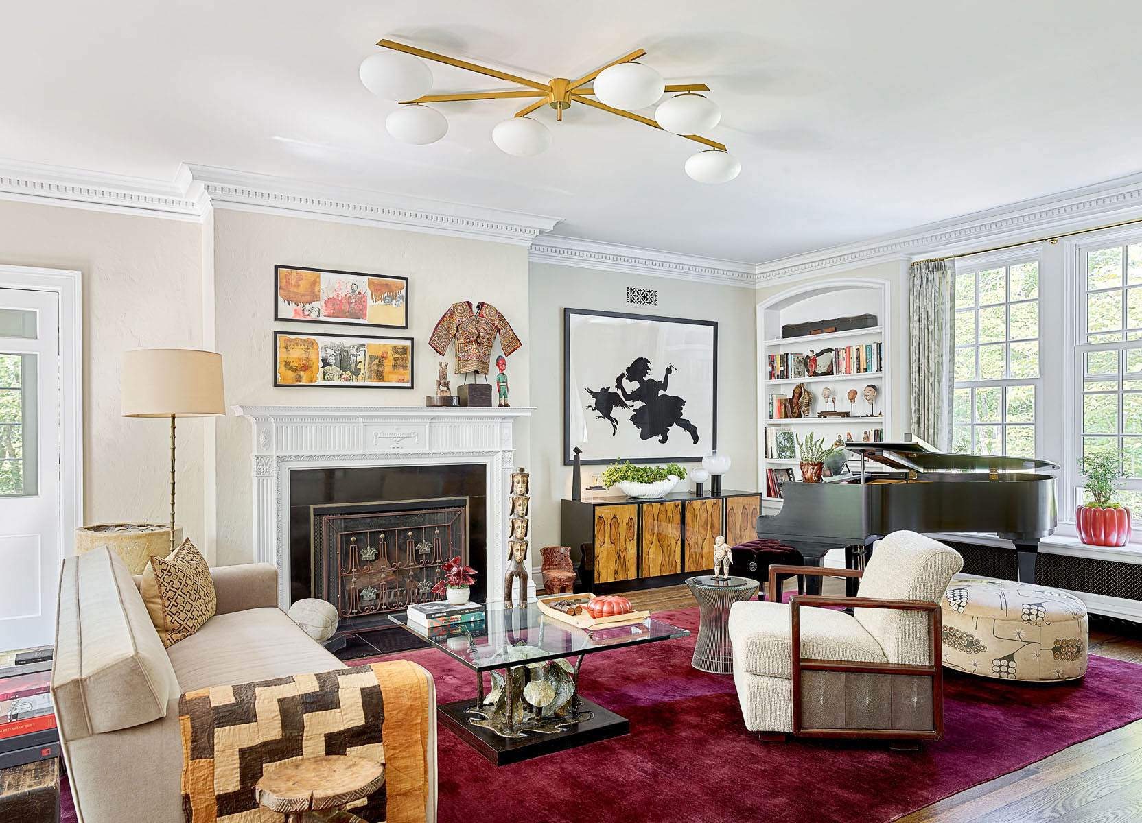
Photo: Michael Robinson.
In the living room above, the harmonious interplay between the home’s architectural elements and the family’s mix of ancient and contemporary art is evident. Kara Walker’s “The Keys to the Coop” above a midcentury rosewood burl credenza mingles with a collection of ancient heads on the bookshelf. Two Almudena Rodriquez pieces hang over the mantle.
“I wanted to use Chinese furniture but it had to be one element,” says Carlos, who folded in mid-century lighting and furniture. “We used pieces that were from that time period but not a cliché. We had some Chinese deco chairs in the living room—instead of upholstering the panels with fabric, we used eel skin. It was another intervention to make things that weren’t so much about style but about collecting. It’s a 70s extension of what mid-century was,” he explains. “When Betsy saw something she liked, she would say, ‘This is me.’ That’s what makes this house so different from any other house.”
For more on this design project, visit Luxe Magazine, or stay tuned for Part 2, when we’ll move outdoors.
- Architecture: Fred Wilson, Morgante-Wilson Architects
- Creative Director: Carlos Martinez
- Interior Design: Daniel Krause, Gensler
- Kitchen Design: Kathy Manzella, De Giulio Design

Are you an architect or designer with a story to tell?
Register with us to receive exclusive discounts and benefits, plus free shipping on your first order. Trade professionals are also eligible for collaborative features on our blog and social media channels. Please note that trade registration with PAGODA RED is only open to interior design and architecture professionals.